HELP CENTER
EBANX GO is a mobile application, which allows users to have a free digital account that offers cashback, promotions and coupons for purchases made at partner stores. During my journey at EBANX, I faced different opportunities to improve my skills and learn from problems using design process to help users having the best purchase experience. This project was focused on improvements for the help center feature.
2022
EBANX
UX/UI
THE PROBLEM
Many customers end up opening calls for simple questions regarding the product or features, which ends up overloading our service.
As a result, one of the initiatives to make our communication clearer was the review and redesign of the help center, a tool that can solve the user's doubts without the need for assistance.
About 31% of tickets opened in CS are general product questions that don't require support.
2. WHAT WE WANTED TO ACHIEVE
Improve customer experience by doubts resolving their queries without having to contact support.
Decreased opening of tickets for questions and issues that do not need assistance.
RESEARCH
As a first step, an internal research was started. I collected and analyzed: CS tickets, clicks on the Help Center, previous surveys on user doubts, and a benchmark of competitors.
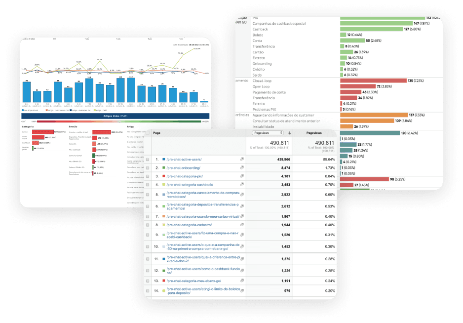
highlights
35% of the tickets opened were questions regarding cashback as well as the most clicked articles in our help center.
10% of the tickets opened were doubts regarding how to purchase in partners stores process.
48.1% of users interviewed previously sought to resolve their queries directly by contacting support.
TALKING TO USERS
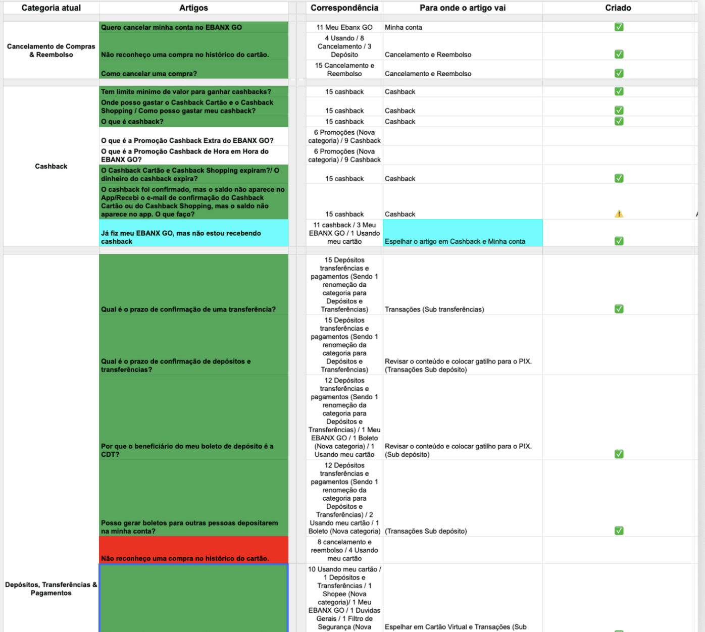
As the process progressed, I felt the need for a qualitative analysis aimed at reviewing articles and categories. With that, an interview followed by a Card Sorting dynamic was developed.
Were interviewed 21 users who had at least one purchase experience on EBANX GO.
During the interviews, we questioned the users about difficulties that they faced during any experience in the App and what were there actions to solve it. For the card sorting dynamic, each user could freely organize articles and categories and also rename then, so in that way we could have a better understand of their mental model.
ANALYSIS
To extract results from card sorting and interviews, I first analyzed the results individually per user to find the main difficulties and problems, then I getter it all the articles and categories and organized in a spread sheets so I could have a quantitive analysis of the answers of the users.
IDEATION
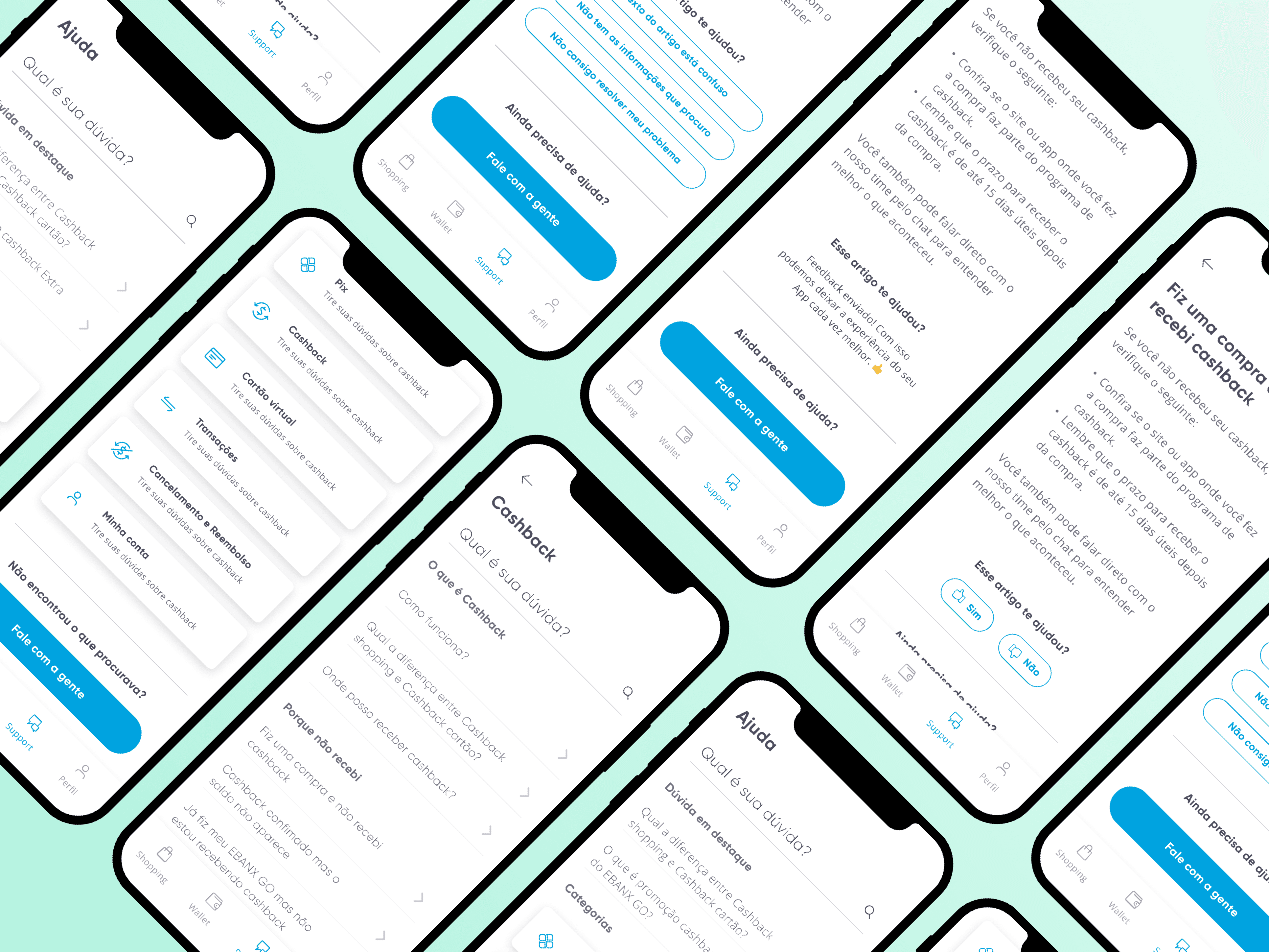
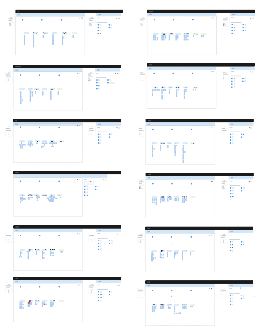
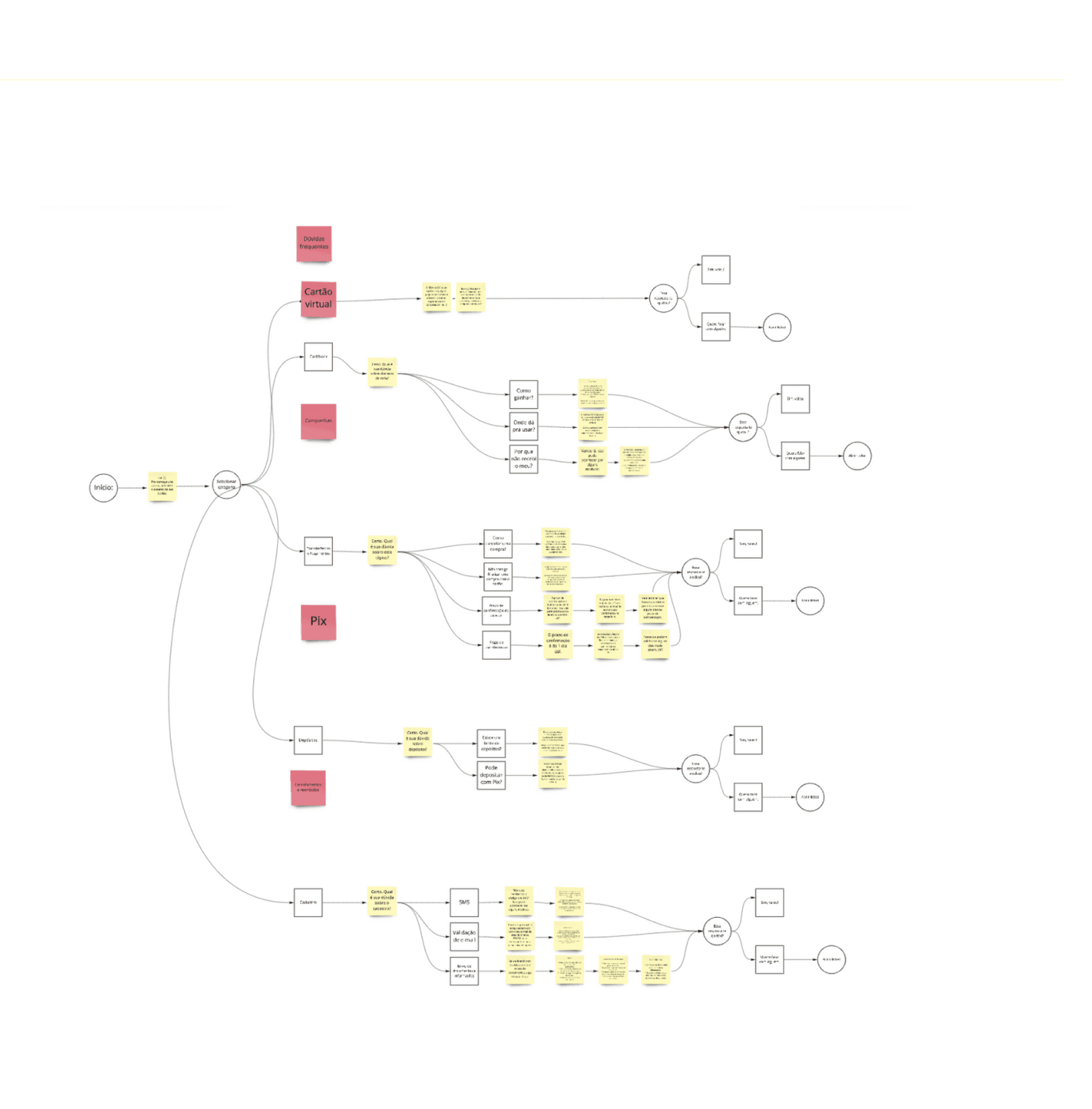
After this analysis, together with the UX writer, we defined what the new help center flow would look like. We used our learnings from the research and card sorting to build a flow diagram with all categories and articles.
KEY SOLUTION ELEMENTS
1
A subcategory level in the flow was created, so the users would have a better experience finding the articles.
2
Were added descriptions in the categories for better understanding.
3
The name of 4 main categories were changed for better understanding.
4
The ordering of the article categories was prioritized according to the most frequently asked questions.
5
6 new articles have been added to our Help Center.
6
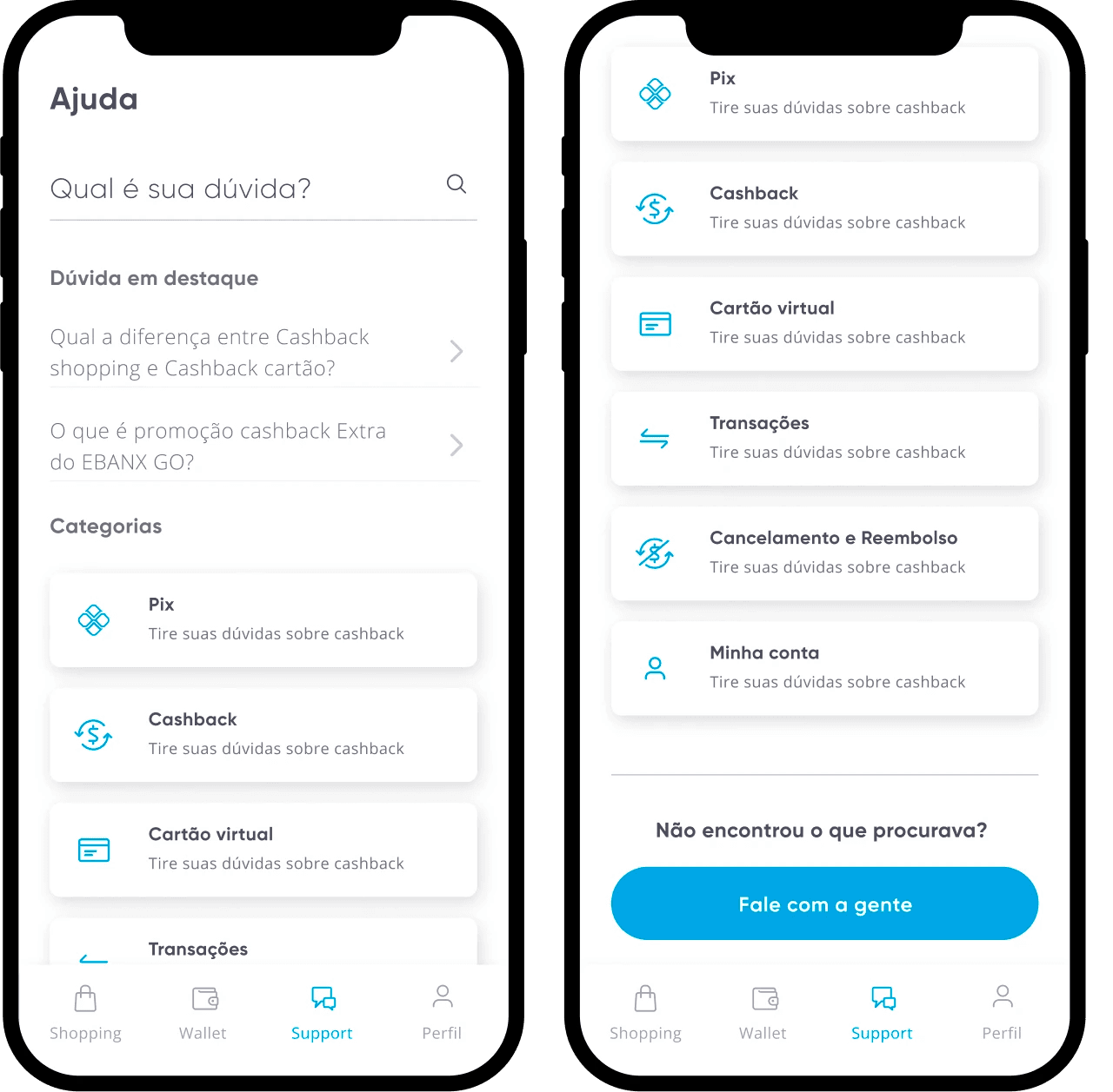
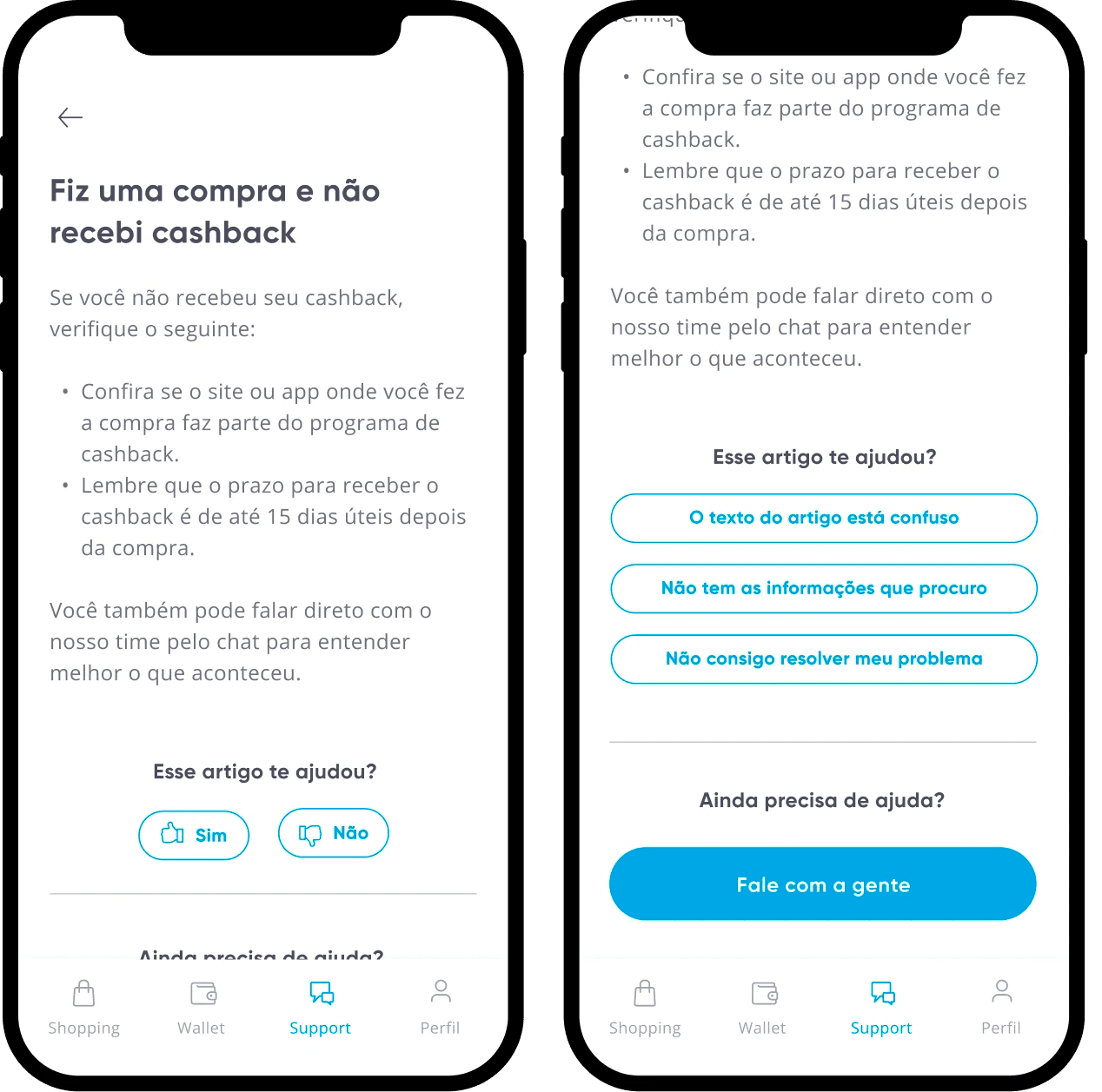
A space for quick access to highlighted articles was added.
FINAL PROPOSAL


NEXT STEPS
Due to more urgent demands, this project had to be frozen. But for the next steps, it would be interesting the application of a usability test, implying the finding of articles to solve user doubts. And also, after the delivery of the project, be aware of the impact on the numbers on CS tickets.