Addi
Addi is a startup focused on credit solutions. It offers loans to consumers in Latin America who want to pay in installments with more favorable conditions and allows a safe cash flow for online retailers. This project was focused on building a new experience based on risk segmentation.
2023
ADDI
UX/UI & Research

THE PROBLEM
When making their initial purchase with Addi, users would become eligible for a credit budget approval, contingent upon successfully repaying their inaugural full loan.
We were blocking low-risk clients from making new purchases before paying
a full loan.
Our application interface had become outdated and was failing to provide our clients with a satisfactory experience in comprehending their credit budget.
RISK TEAM PROPOSAL
With that, the Risk team brought a different credit experience to the table: the transaction-base credit. Through this enhanced framework, we will now have the capability to more effectively assess our customers during their initial purchase. This will enable us to provide an optimal experience without compromising our risk exposure to less responsible customers.
GOALS
Increase returning client conversion.
Improve the credit line experience.

DESIGN PLAN
With the development of the risk team proposal, we saw an opportunity to bring improvements to the credit experience as a whole.
I started by writing a planning document and roadmap and outcomes from the design work and validating with stakeholders.
UNDERSTAND
I initiated the process by aggregating our existing knowledge from previous research endeavors, along with identifying recurring complaints highlighted within our CX and NPS data.
This compilation encompassed pertinent details such as frequently encountered issues, valuable insights, and noteworthy recommendations to bear in mind moving forward.
The general problems revolved around:
Unreliable credit behavior
Not knowing the credit limit

JOURNEY MAP
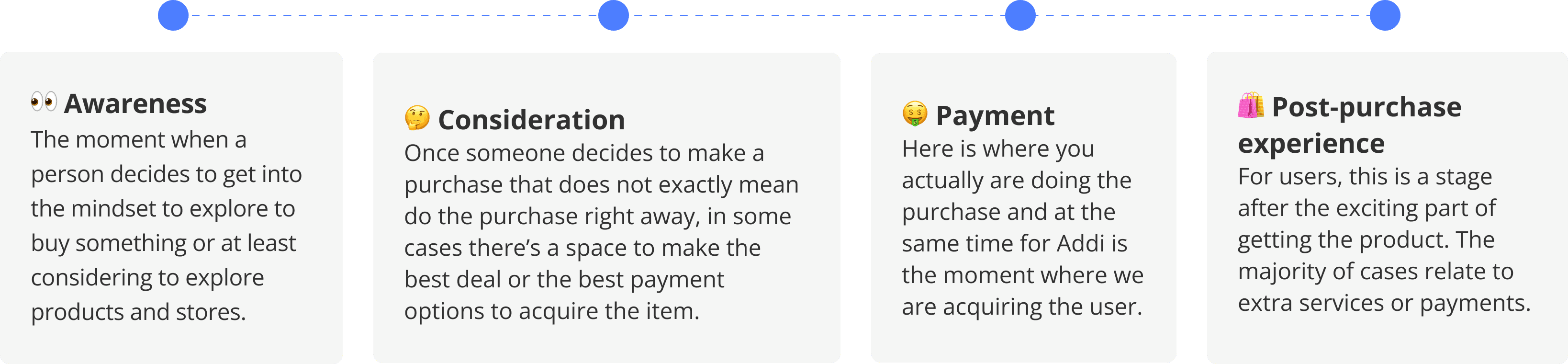
I opted to adopt a broader perspective, encompassing the entire user journey rather than just concentrating on credit or additional requirements. This approach was centered around gaining insights into user behavior. Consequently, I undertook the construction of a comprehensive journey map, aiming to delve into user scenarios, identify pain points, and recognize needs more comprehensively.
PRODUCT ASSESSMENT
Recognizing an additional opportunity, I seized the chance to conduct a thorough product assessment of the existing experience. This involved cataloging usability issues that could potentially be addressed in tandem with the development of this project.

MAIN PROBLEMS
1
Outdated UI
The UI of the application had not been executed to the desired standard and was no longer aligning with the company's image. The excessive use of colors and textures deviated from the concept of a finance-oriented application, potentially causing users to doubt the company's credibility.
2
First purchase
Since users were required to complete their initial purchase to earn credit, this process was not adequately explained. Additionally, the store section within the application was not prominently displayed, which could lead to confusion.
3
Credit Summary
The way we were presenting the credit limit summary lacked visual clarity and was in need of improvement. Furthermore, the explanation regarding the upcoming installment was unclear.
UX OPPORTUNITIES
1
App's redesign
Given the scope of this project, spanning across various facets of the application, and owing to our identification of numerous areas ripe for enhancement, we recognized the prospect of utilizing it as a foundational stepping stone for initiating a redesign and development of the new Design system.
2
Terminology patterns
Engage in a reevaluation of the terminologies employed and deliberate upon the manner in which we intend to articulate our advantages.
4
Explanation of the credit limit
Enhance the clarity and effectiveness of our experience regarding the credit limit, encompassing guidance on its utilization, methods for augmentation, and prominent display locations.
5
Future features
Additional prospective impactful features emerged during the analysis, including concepts like Merchant Boosts, Budget Increase Requests, and facilitating exploration of the app for non-users.
BUILDING
As I delved into the design discovery phase, simultaneously, the risk team was engaged in formulating a user segmentation proposal. Upon their presentation of the initial proposal, collaborative efforts were initiated as we began working together seamlessly.

DEFINITION
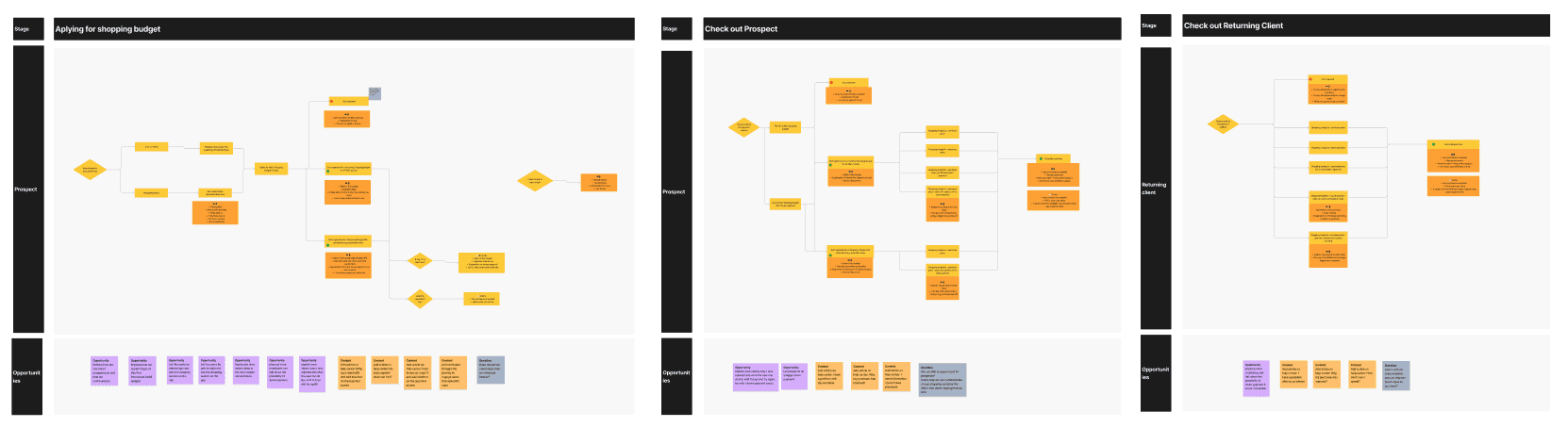
In the preliminary release, we opted to center our attention on two specific profiles: those classified as low-risk and high-risk. Subsequently, I embarked on the task of constructing the user flows.
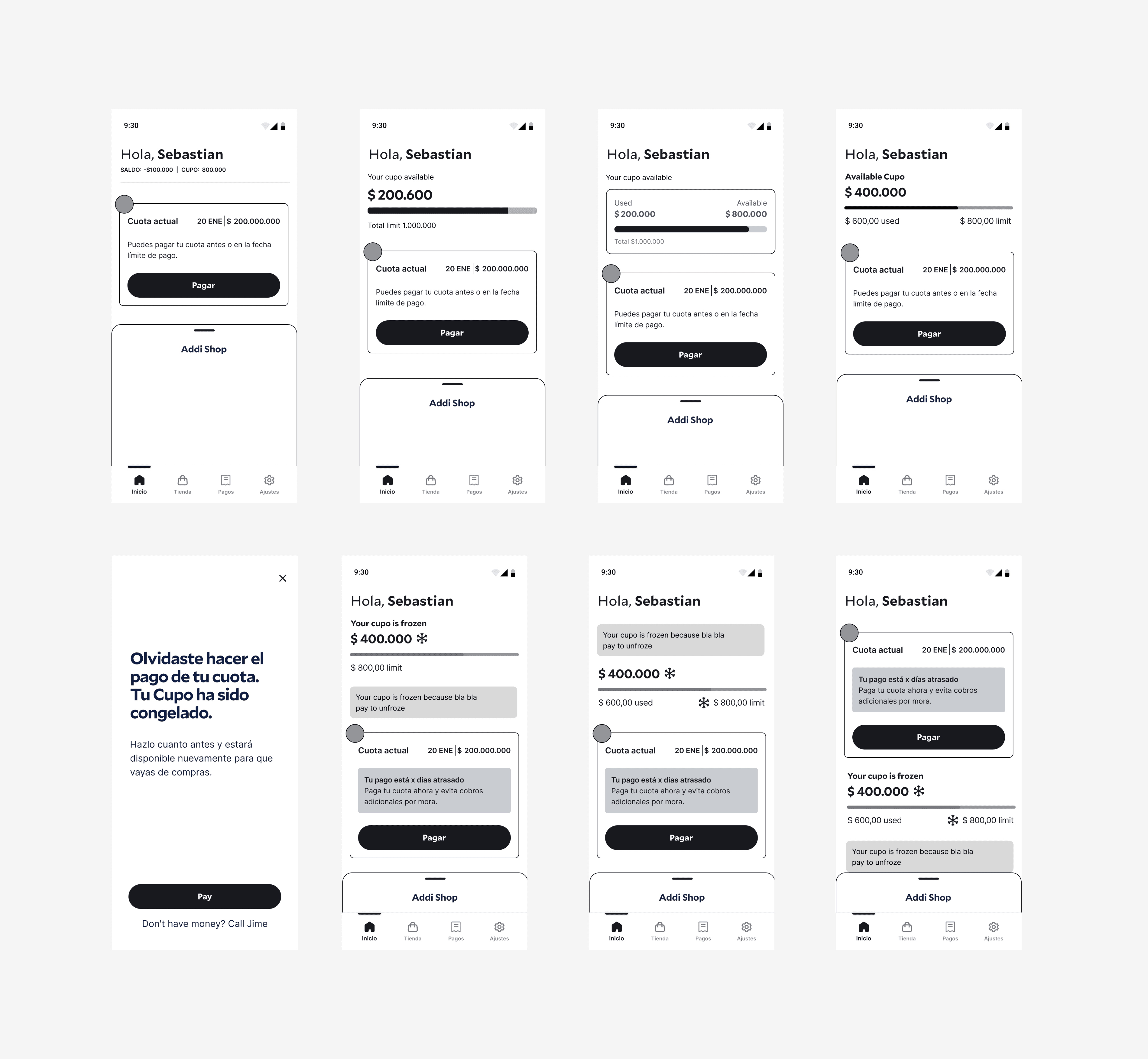
WIREFRAMING & TESTING
Initiating the wireframing process, I took into account the screens that required modifications and the necessary copy adjustments. This ensured a streamlined workflow, enabling the writer to commence their tasks concurrently.
Based on the wireframes, I opted to conduct a perceptual test featuring various alternatives for displaying the credit limit.
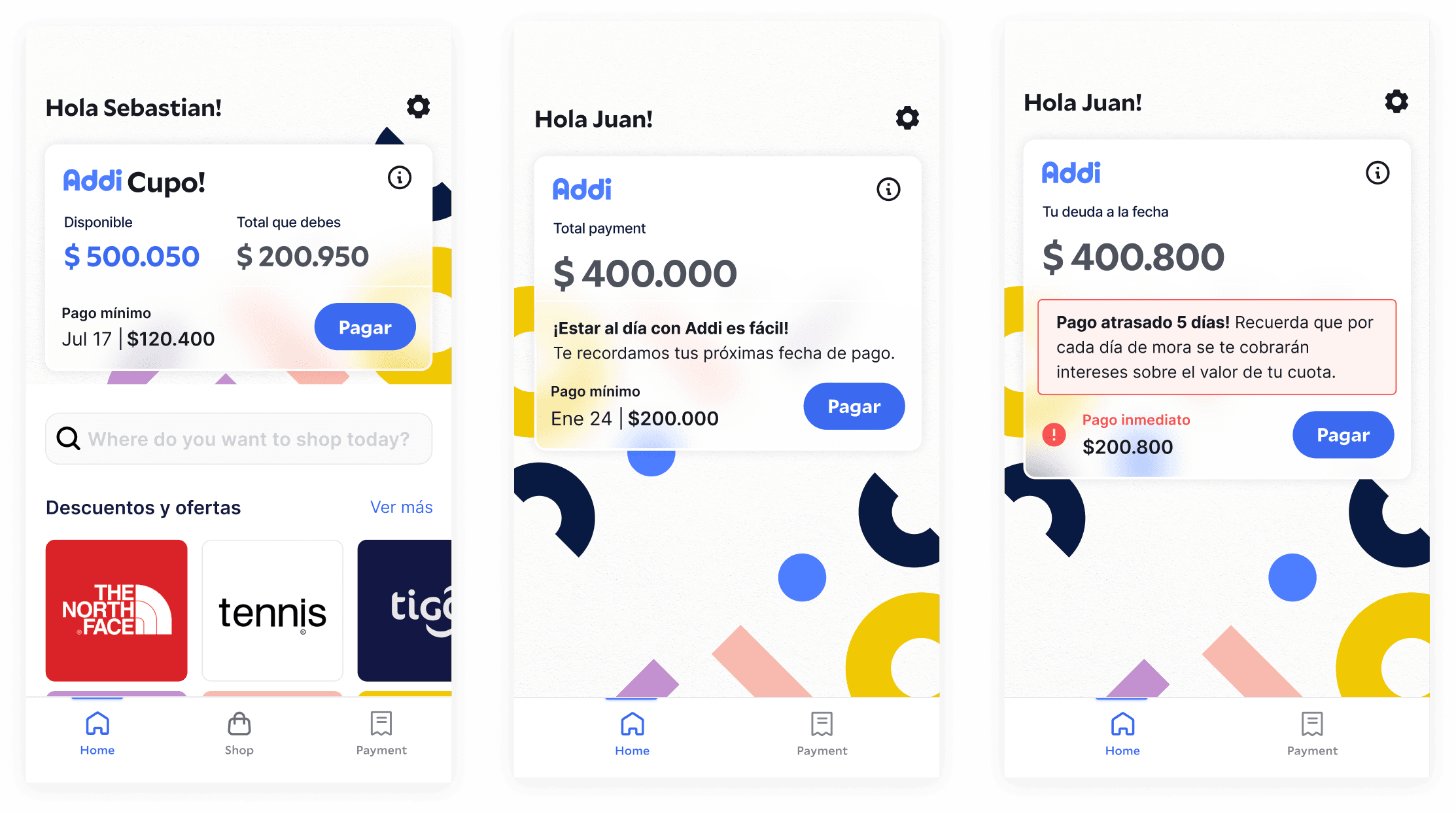
SOLUTION FOR LOW RISK USERS
NEW SUMMARY
Low-risk customers are granted a credit line for making purchases. To address this, we have revamped the display of the total credit available and utilized in a manner that enhances comprehensibility and visual appeal.


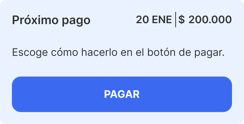
PAYMENT CARD
We've also refined the method for displaying upcoming installment payment statuses, enhancing the copy and providing clearer information about the next payment. Additionally, we've included a shortcut for easy access to the payment process.
DIFFERENT STATUS
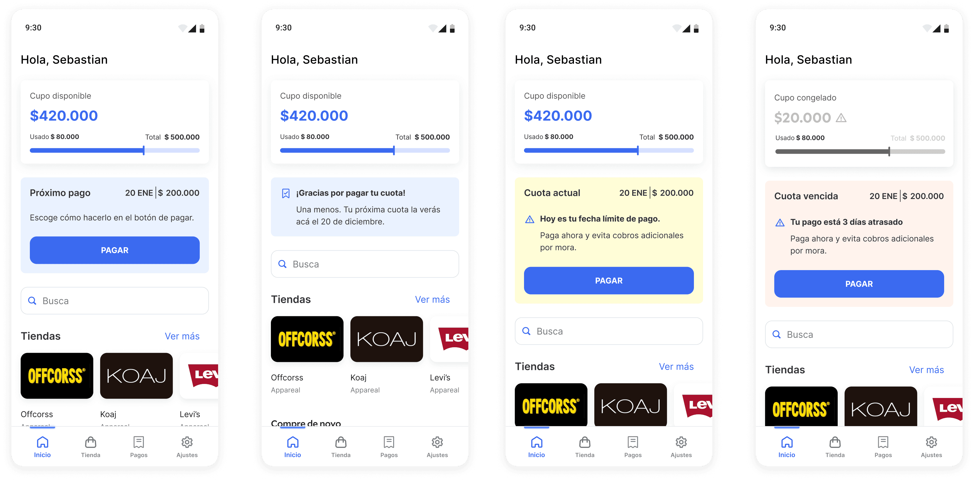
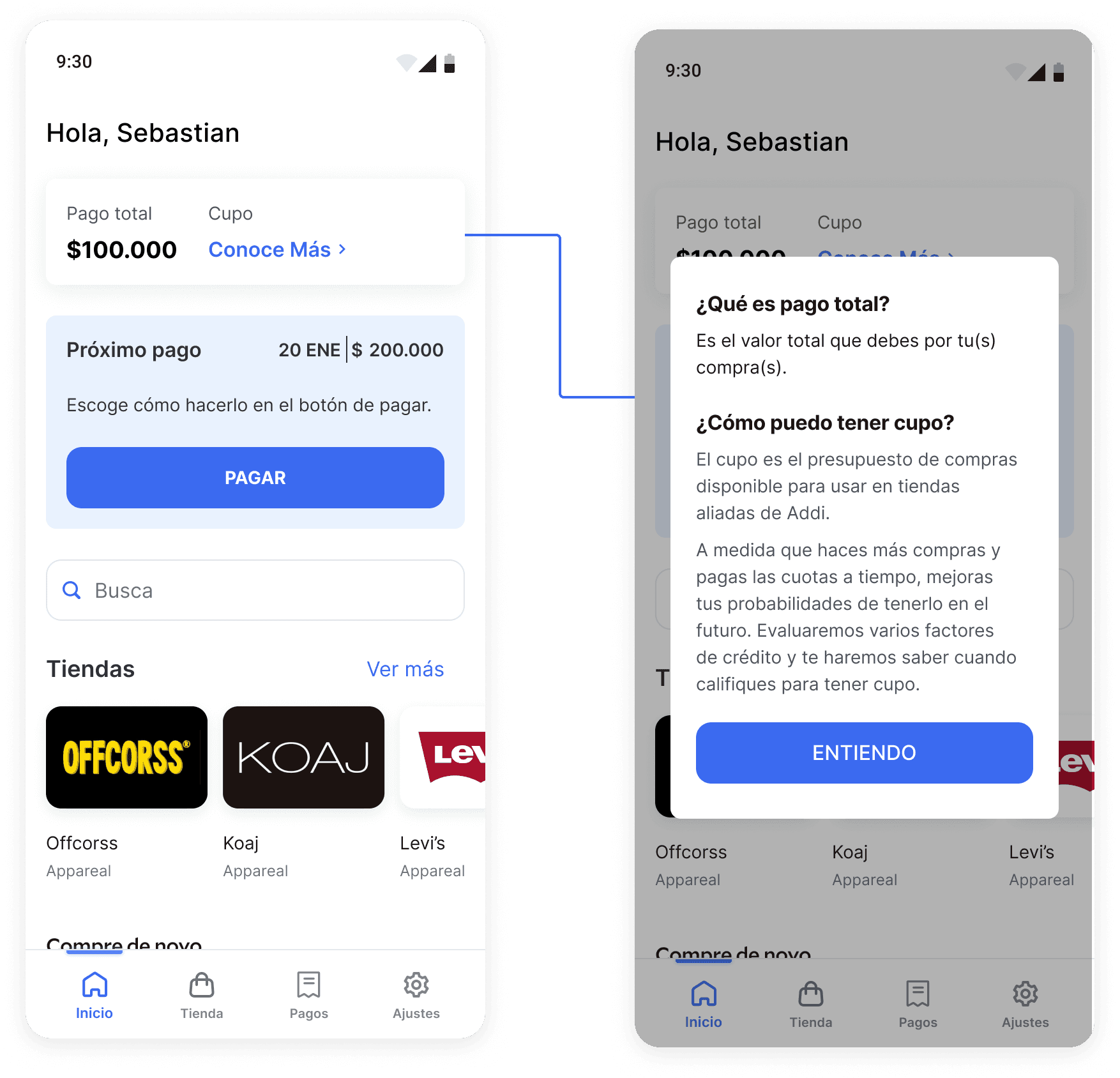
HIGH RISK USERS
For high-risk user experiences, we've introduced an informative section explaining what a credit line is and how to acquire one.
IMPROVEMENTS IN THE CHECKOUT
We've also implemented UI enhancements in the checkout flow within merchant interfaces. Alongside copy improvements, we've introduced a new confirmation screen and a WhatsApp message feature that provides more information about the credit line and upcoming payments.

RESULTS & NEXT STEPS
This project served as the foundation for the development of our new design system. A dedicated team of developers was assigned to construct this system, while designers began incorporating the established foundations and components into their projects.
Due to the extensive scope and the significant restructuring efforts undertaken by the risk team, the project is still in development. However, we anticipate significant outcomes with the new design, enabling more customers to make repeat purchases shortly after their initial loan, thus enhancing our overall results.