CASHBACK VISIBILITY
EBANX GO is a mobile application, which allows users to have a free digital account that offers cashback, promotions and coupons for purchases made at partner stores. During my journey at EBANX, I faced different opportunities to improve my skills and learn from problems using design process to help users having the best purchase experience. This project was focused on improvements in transactions area in the mobile App.
2022
EBANX
UX/UI
THE PROBLEM
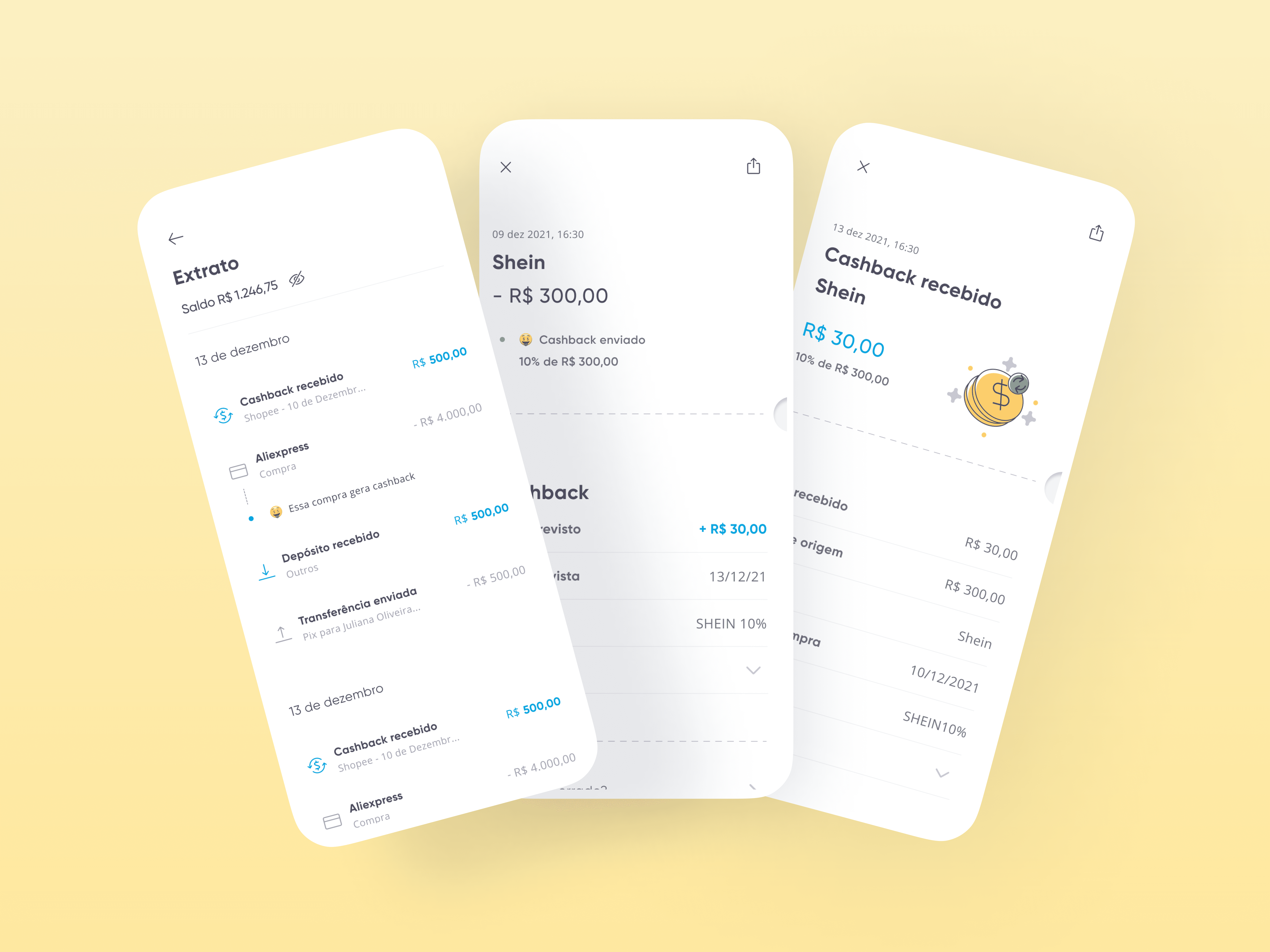
When making a purchase, the user doesn't have sufficient visibility of the rules for receiving the cashback and whether it has been approved.
Over 23% of the tickets monthly in CS where about the receiving cashback.
High occurrence of complaints about the cashback receipt in store reviews.
2. WHAT WE WANTED TO ACHIEVE
Decrease the occurrence
of complaints in the store, improving our score.
Decrease opening tickets in CS, to unburden our support team.
Improve user experience by giving more visibility about the cashback process.
FINDING THE SOLUTION
After analyzing the types of complaints in stores reviews and those of our support, I started a series of dynamics with the squad to choose and prioritize the solution.
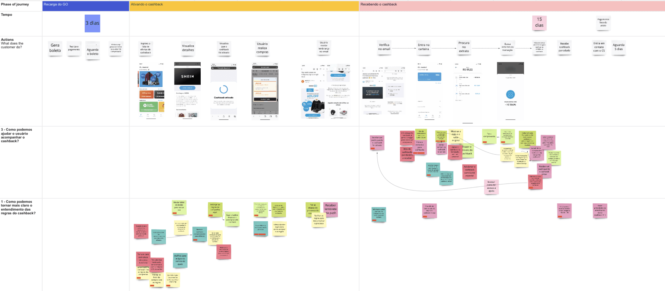
USER JOURNEY
PAINS ANALYSIS
Pains and opportunities were mapped throughout all purchase process and receipt flow.
SOLUTION IDEAS
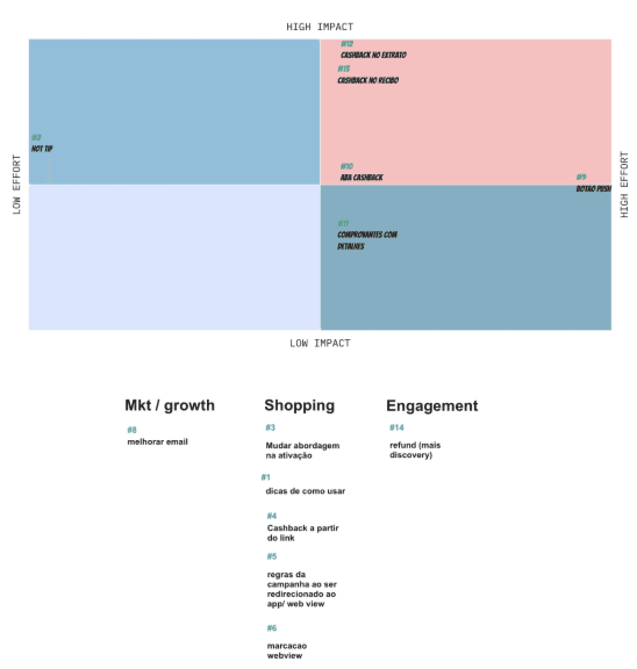
After the main opportunities and pains been mapped and listed, we made affinity diagram and explored different solutions.

PRIORIZATION
To define which would be the prioritized solution, the effort and impact matrix was used. Some of the solutions were outside the scope of our squad, so these ideas were communicated to the teams in question.
After the dynamics, we decided to focus on improve the statement and receipt to cover the user needs.
BENCHMARK AND IDEATION
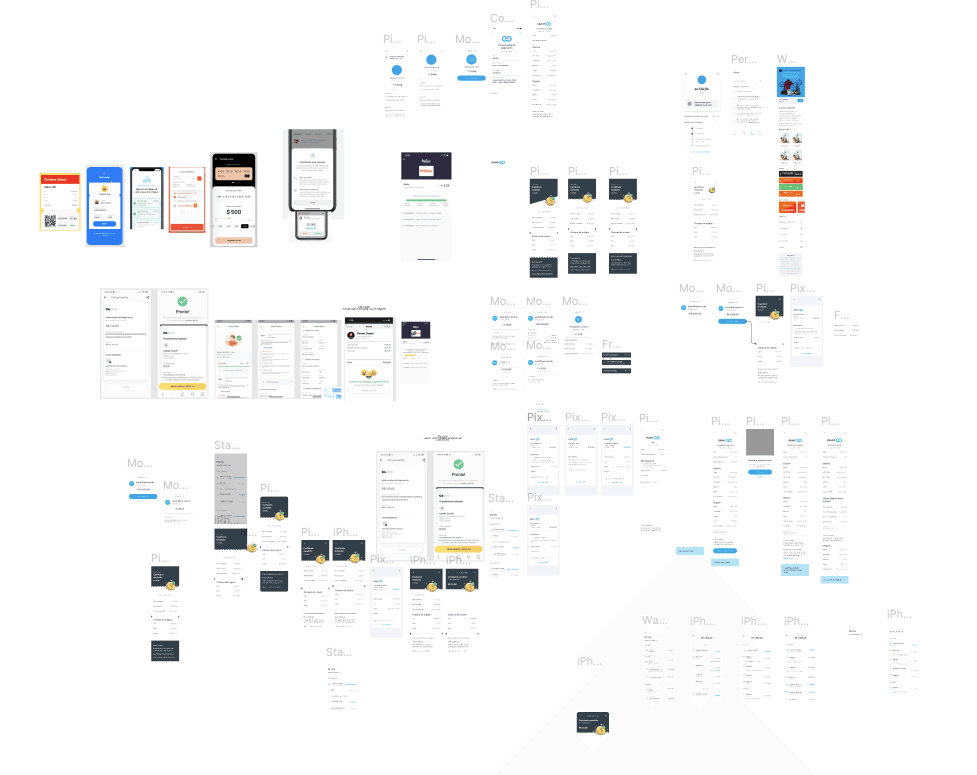
Before starting to build the screens on figma, I did a quick benchmark with competitors from statements and receipts. Then I started exploring layout options.

DESIGN CRITIQUE
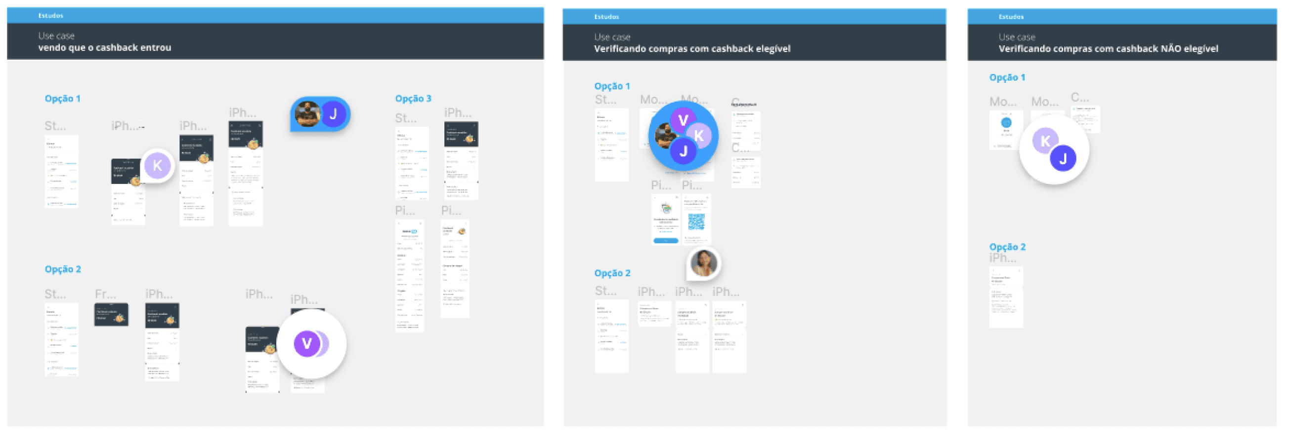
With some options ready, I did a design critique with the design team to validate and choose the final screens.
FINAL PROPOSAL
In the final proposal I made changes to the summary page as well as all the transactions details page.
SUMMARY
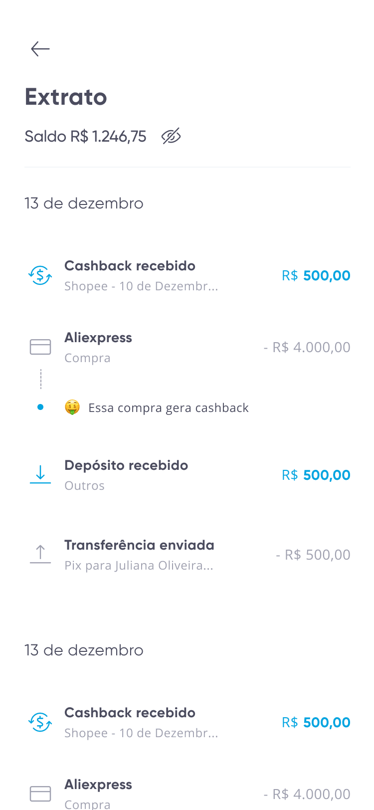
In transactions that generate cashback, an indication was added on the summary screen. This way, the user does not have to enter the details page.

PURCHASE WITH CASHBACK
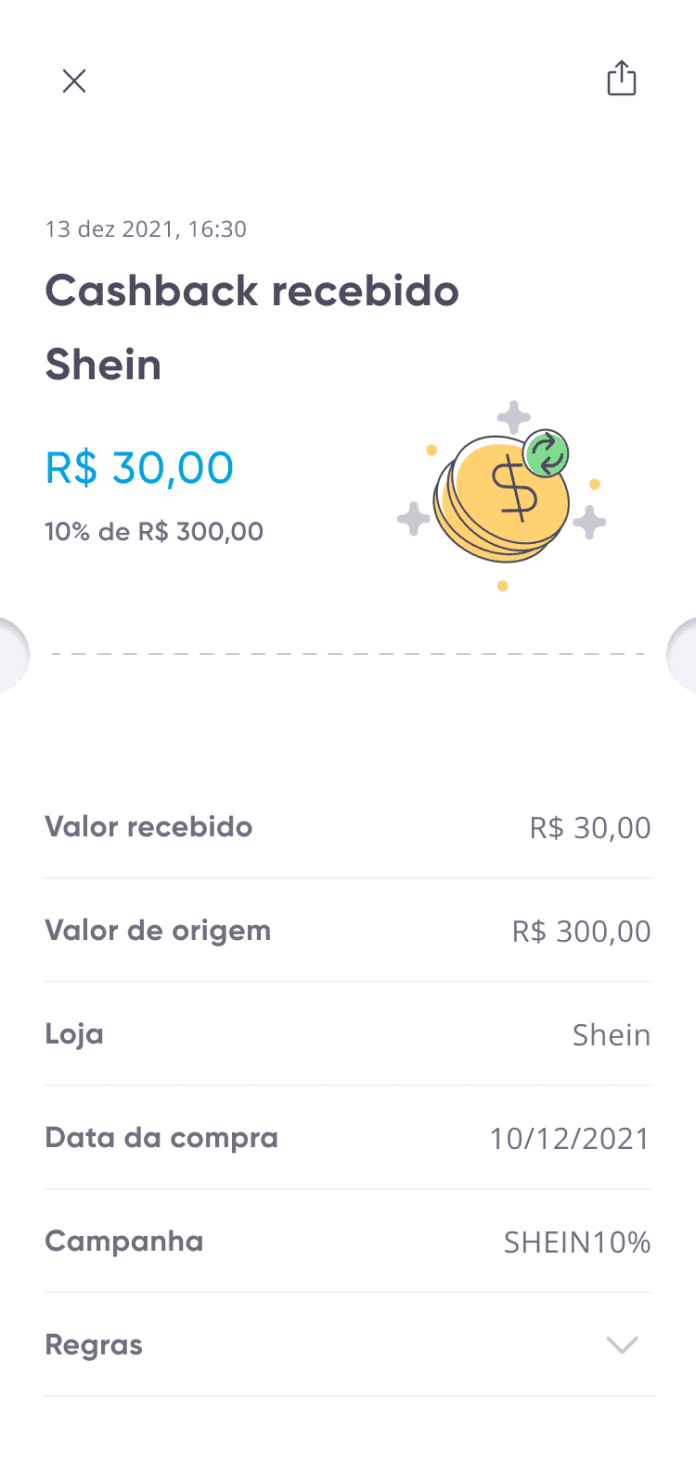
In transactions that generate cashback, in the details page was added a status bar indicating if the cashback is still in process or was paid. Also, a cashback receipt details page was added.

In process

Paid
Cashback Details
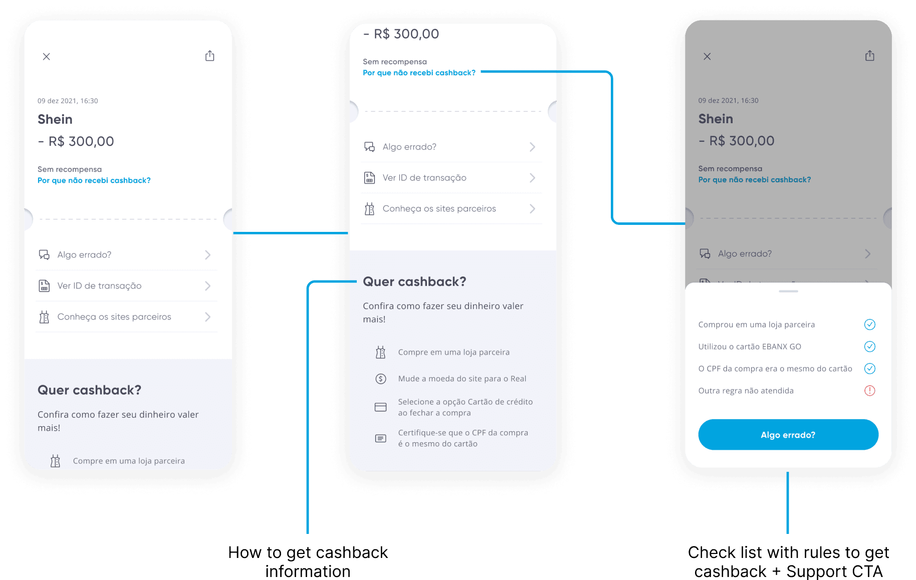
PURCHASE WITHOUT CASHBACK
In transactions that didn't generate cashback I focus on explanation of why this happens and how to get cashback in the next purchases.
BUSINESS IMPACTS
After a month of having the new statement and receipt implemented, we were already able to reap some results.
After the general analysis of the journey, the squads started to prioritize the development of solutions that had been discovered during this project.
We managed to increase 0.3 points on the app store and 0.4 on the playstore due to the decrease in the occurrence of negative comments.
Tickets related to cashback had a decrease of almost 40%, reducing the load of our attendants.
